
Introduction Video //:
Welcome to Web-Weaving Witches! By taking the first step and saying yes to this program, you are already beginning to lay the foundation of your future website. This journey will guide you in identifying the spirit of your brand, a crucial component that will inform the cohesive look and feel of your one-page site. Together, we will explore how to translate this brand essence into visually appealing designs that resonate with you, and your audience.
Through this process of learning, you will gain tools and insights that extend beyond the initial design work. These foundational concepts will empower you to evolve your site over time, allowing for future expansions and enhancements as your vision grows.
So let’s get web-weaving, Witches!
Program Objective //:
To guide you through the process of creating a one-page website on Squarespace, focusing on design elements, setting up a blog, a store, and customizing the template to reflect your unique style and brand - getting out of your own way, so you get seen and heard.
Key Steps //:
Lesson 1: Wrapping Roots Around Bone
Customize design elements such as color, fonts, and typography site-wide in the style settings.
Set up the blog and store with specific design considerations.
Lesson 2: ‘Altar’ Your Site
Define your brand style to align your page with your vision.
Implement tips and tricks to personalize the template and create a cohesive page that reflects your identity.
Break down the content creation process into manageable pieces.
Bonus tutorial, by Danielle Dulsky, for creating your own ‘word palette’ for content.
Tips & Tricks //:
Take your time to understand and implement each lesson thoroughly.
Utilize the provided exercises and resources to enhance your website's quality.
Stay inspired by taking breaks, engaging in activities that rejuvenate your creativity.
Embrace the process and enjoy the journey of creating your unique web presence.
For more serious help with your designs, web, or branding - I can offer assistance at my hourly rate, to either consult on your project ($150/hr), or take over and complete some aspect of the project on my own ($200/hr). I work very fast in these realms, but can only offer an hour here and there as life is busy for digital witches! Contact me HERE for hourly help inquires.

Lesson One //: Wrapping Roots Around Bone
lesson Objective //:
To customize the site styles of your Squarespace website by adjusting colors, fonts, buttons, and forms to create a unique and branded look.
Key Steps //:
Colors:
Access the back-end dashboard of the Squarespace website.
Change the website name to your own.
Choose a color palette by perusing my Color Palace on Pinterest, using a Squarespace ‘preset’ or other color sources.
If using a picture as your paletter inspo, capture a screenshot and upload it to Canva. You may wish to use the template I made for you, HERE, that is shown in the demo.
Extract color codes and apply them to your Squarespace site.
Fonts:
Select appropriate fonts for headings, paragraphs, buttons, and miscellaneous text.
Ensure readability and choose fonts that align with your brand's style, at least as you know it to be at this point.
Experiment with font weights, sizes, letter spacing, and text transformations.
Remember you may use one bold and one polite font for a cohesive design, if you choose a wild or loud display font.
Buttons:
Customize primary, secondary, and tertiary buttons by adjusting font, size, style, and shape.
Choose between square, pillbox, or other button shapes.
Modify button outlines, padding, and hover effects for a polished look.
Forms:
Decide on the shape of text boxes and borders.
Adjust padding, hover effects, and submission button appearance.
Choose submission feedback options like spinning circle or ellipsis.
Tips & Tricks //:
Break down the customization process into smaller tasks to avoid feeling overwhelmed.
Make adjustments one step at a time to retain information and avoid confusion.
Utilize preset options in Squarespace for quick customization or create a unique design from scratch if needed.
Designing Your Blog
lesson Objective //:
To setup design for your blog page, so that all future articles can be duplicated from your original design that you perfect and love. Get familiar with the settings you will need to review or adjust before publishing a writing.
Key Steps //:
Design Blog Archive Page:
Go to the main menu, select Pages, and scroll down to find the blog page (named Archive).
Click on Edit to access the blog page.
Adjust the layout (grid blog, side by side, single column) to change the appearance of the archive.
Customize vertical spacing, image placement, aspect ratio, image size, image spacing, text alignment, title spacing, text content width, and read more spacing.
Experiment with background color options to find a suitable look.
Save changes and exit.
Design Individual Blog Page:
Edit an individual article within the blog content.
Customize the design by adding lines, text boxes, buttons, videos, spacers, quotes, images, galleries, audio, and more. Just play with all the options and become familiar and comfortable with their use.
Adjust image size and alignment by using spacers and toggling options.
Ensure proper spacing and alignment for a visually appealing layout.
Save changes and exit. Duplicate your design for future articles, them customize them.
Finalizing and Publishing:
Review settings for each article, including excerpt length, author, URL, and publishing status.
Customize social media image and URL preview, if desired.
Save changes and schedule or publish the article.
Add tags, categories, comments, and featured post status as desired.
Copy the URL for sharing on social media or in email campaigns.
Tips and Tricks //:
Experiment with different design options to find a layout that suits the website's aesthetic and content.
Utilize the available design elements creatively to enhance the visual appeal of blog pages and articles, add images, video, audio files, etc..
Save time by duplicating drafts and making necessary edits for new articles.
Add a newsletter form to the bottom of your blog page!
Setting Up Your Store
Lesson Objective //:
Set up products in a Squarespace store by adding, editing, and customizing product details..
Key Steps //:
Adding a Product:
Go to the product section and upload a product.
Duplicate the product to add more items.
Editing Product Details:
Edit the product section to adjust alignment, pricing, categories, and column spacing.
Choose the number of columns for product display.
Set the aspect ratio of product photos.
Customize colors if needed.
Save your work periodically.
Customizing Product Information:
Rename the product, add a description, change images, and set prices.
Adjust stock availability and SKU if necessary.
Add variants for different colors or sizes.
Consider adding a flat shipping fee if applicable.
Ensure product visibility, categorization, and tagging.
Creating Customer Forms:
Create forms to collect customer information if needed.
Include required fields like name and email.
Add optional fields like drop-down menus or text boxes for additional data.
Save the form for future use.
Publishing and Scheduling Products:
Save your work and schedule products for publishing on specific dates if needed.
Tips and Tricks //:
Use product duplication for quick additions.
Customize product URLs for easy sharing and linking.
Resources //:
HERE is a link to the e-book graphic I made in Canva. Feel free to re-design this template for your own work and website use.
HERE is a Squarespace article on setting up shipping rates in your store.
HERE is an article on setting up shipping rates, using TaxJar with Squarespace, that will automatically calculate shipping for you - but is an additional service fee.

Lesson Two //: ‘Altar’ Your Site
Word Palette Tutorial
In this mini-lesson, Danielle Dulsky introduces the concept of a word palette, a tool designed to help you find language that feels deeply authentic and personally meaningful, to use on your site. By curating a set of words that feel a bit "seductive" to you, the word palette ensures that your writing resonates with the right audience—those who are truly aligned with your message. The idea is that people who connect with this language will be "wholly" for you, while those who don’t will naturally be filtered out, allowing for more authentic connections with your readers or clients.
Creating a Visual Language
The 'Creating a Visual Language' audio tutorial is adapted from my larger Branding and Website Accelerator Program. In the original version, various writing exercises were used to help identify the core elements of a brand’s visual identity. However, for our uses, please ignore any references I make to those writings (unless you have done them previously in ‘Ritual Branding’).
You'll engage in a movement ritual, tuning into both your body and the essence of your brand. As you move, let the words, images, and sensations that resonate with your brand rise to the surface naturally. You will need paper and a writing tool. You might want to do this exercise near your web-weaving altar, if you created one, then later leave your visual language on it.
There is a bit of crossover with Danielle’s word palette, but both are great for grounding into your vision and guiding your design mind forward.
Enjoy, have fun, surrender and see what comes. You might be surprised.
Gathering the Elements
Objective //:
Gather visual elements and inspiration to create a cohesive and on-brand website.
Key Steps //:
Review Visual Language Tutorial Results: Ensure you have completed the visual language tutorial and have a clear understanding of the visual elements and mood of your website.
Access Pinterest: Return to (or create) your vision board on Pinterest, and search for images that align with the mood and visual elements of your website design.
Build Vision Board:
Limit visual elements to five or fewer to maintain a cohesive look.
Save images that resonate with the mood and aesthetic you are aiming for.
Keep in mind your brand colors while selecting images.
Select Inspirational Layouts:
Search for 1 website design inspiration on Pinterest. This is just for inspo, not an exact copying mechanism.
Avoid overly complex layouts that may be difficult to replicate.
Refine Vision Board & Gather Stock Images:
Pare down the vision board to a concise collection of images.
Ensure the vision board reflects the overall look and feel of your website design.
Visit unsplash.com to browse for stock photos.
Search for unique stock photos that align with the visual language of the website.
Tips & Tricks //:
Keep the vision board focused on key visual elements to maintain a cohesive design.
Consider the simplicity of the layout when selecting website design inspirations to ensure ease of implementation.
Regularly refer back to the vision board during the design process to stay on track with the desired look and feel of the website.
Avoid using stock photos that look generic or overused.
Do not solely rely on stock photos; incorporate personal photos for authenticity.
Ensure the quality of personal photos is clear and suitable for website use.
Mapping your layout & content
This section is one I pulled from my larger Accelerator Program. It will break down the process of understanding what content you need and where it will go on the page.
Action Steps
Gather a pencil, paper, scissors, tape
Pull up your Pinterest board, with your website inspirations
Create a long paper to emulate your home page
Sketch out a plan for your home page layout, using your website inspirations, keeping in mind your intended offerings
You are not doing any copy writing with this exercise, just mapping the layout and understanding the scroll flow you will be building
Copy Writing: Home Page
Now we come to our crowning moment of copy writing. Surround yourself with your home page map, word palette, visual language list, and any other applicable writings. Remember to keep things concise, giving enough information to let your ideal client know who you are, what you do, why you are for them, how you serve them.
In your first draft let the words flow out of you, but with each piece you are writing, check in with that home page layout map, so you are only creating what is needed. AND also, you will be finding a compromise between that layout map and what needs to be added and included on the home page.
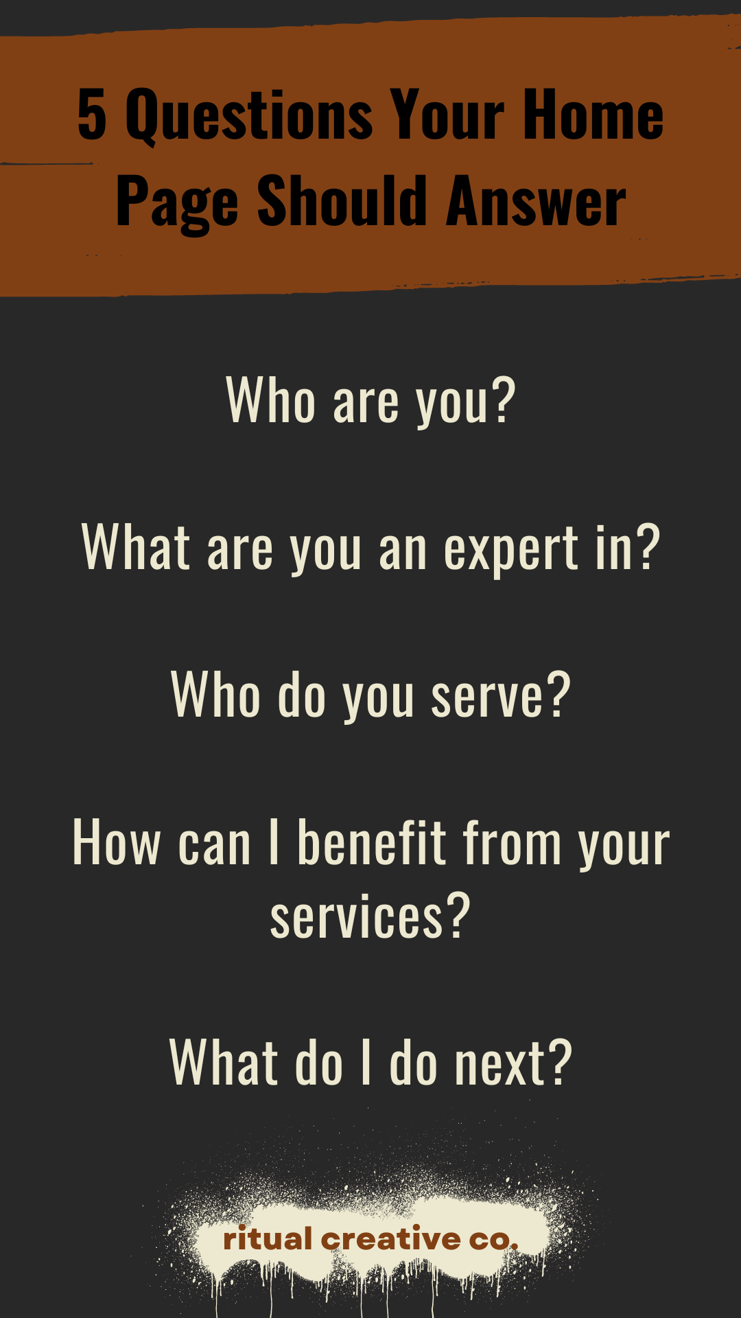
Copy Writing: Short Description of Offerings/Services
You may end up having full pages dedicated to the services you provide. That's another copy writing journey for another day.
For this section, I want you to write very short descriptions, that you will have on your home page, that will let someone know a 'little bit' about what that offering is and make them want to click that button which takes them to the sales page or for now, maybe a button to schedule a connection call or session.
You might not end up using every description on your home page, but this is a good exercise in describing what you do, in a concise, easy to understand way. Aim for no more than 3-5 sentences.
Copy Writing: About
Your 'About Page' isn't just about YOU. It's about your ideal client and the problem they are facing and how you are their to support them with it. This checklist is going to be more useful for a full About Page, but I want to include it here as a guide and inspiration for what you might include about yourself on the Home Page.
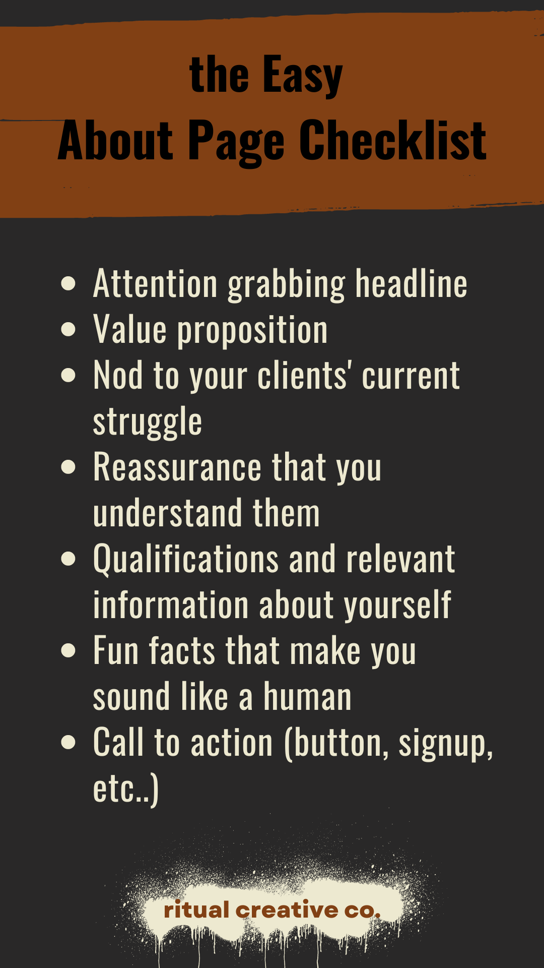
I like about pages that are fun and go outside the old norm of a bio, written in the 3rd person. Unless you are starting to appear as a guest on podcasts, invited to speaker gigs, or some other reason that one would need to easily pull your professional bio from your about page... you are free to make this page feel and read like you.
So who are some of your web-loves? The personalities on social and the web that you gravitate towards. Yours will be different than mine, so I invite you to do an exploration exercise, checking out how some of your most inspirational or beloved web-friends have set up their about pages.
If you end up extending past a one-page website, you can do the same thing we did in the last video, and mockup an 'about page map', then create your copy - keeping in mine the about suggestions for what to include in the copy.
It will be about you...but really about them and how you support them.
Final Thoughts: Reduce, Reuse, Recycle
Copy Editing and Trusted Sounding Boards
After finishing the writings above, take a breath, or a walk, or a day or two... then come back for copy editing. Be sure to look at it with fresh eyes, this is important. Sometimes what comes out of us in a writing frenzy can be a bit much or run into tangents when we revisit.
If you have someone that you trust, that knows and loves what you do, ask them to give it a read and let you know if it, a) makes sense, b) gives an accurate description of you, your brand and offerings, and c) feels inviting and connects with the reader.
Pull Excess Copy onto Other Pages & Stockpile Marketing Copy
If and when you cut down your original draft, be sure to save the parts you 'really love', but don't work for the home page. These writings can be used on sales pages, blog articles and throughout your marketing content.
I like to keep a doc for sales page copy and a separate doc for marketing content writing, as a running list of great sound bites that have come through me.
Also... if you are working with a social media scheduler, it is a great opportunity to plug some copy in with an image and get it on the calendar to post!
Seriously though: GOOD JOB! You have single-handedly worked through some of the most uphill copy writing tasks of your website. That's amazing!
Bonus Tutorial: ‘Sections’
This is another tutorial I pulled from my previous Accelerator Program, so you will see me doing demo on a different website than ours. It will walk you though the ins and outs of ‘sections’, to support you in your layout design and walk you through some of the available ‘pre-designed layouts’ available on Squarespace. Please disregard anything I say that doesn’t apply to our work.
Also, keep in mind that even though I encourage you to ‘play’ with and get familiar with sections, you may want to ‘undo’ this work after experimenting, so that you can follow along with the tutorials of our ‘Template Shape-Shifting’ #1, 2 and 3, for our Web-Weaving Witches work.
Creating Home Page Sections
Give yourself plenty of time to explore and not have anything 'matter', as you get familiar with section types, block options, moving blocks around on the grid, resizing and more. Taking your time honing these skills will serve you well as your trudge along in your design process. When I first came to web design, I let my beginners mind be fully curious about what was available to me.
When it comes to laying out section design, think: COLLAGE
I find section design and layout design to be the digital version of creating a magazine cutout collage. Instead of gluing word snippets and pictures onto a back board, you are uploading digital images and creating text boxes, then choosing where they look best, deciding how they will layer on top of one another, what needs to be most prominent and highlighting the important bits with the digital tools available to you (think of this as glitter glue or sequins).
What you should know after this step:
What section templates are available & how to tweak them
Change the 'color theme' for each section & review of how to change the color of a specific item using 'site styles
Create a section layout design from using a 'blank section' and adding blocks
FEARLESSLY move blocks around, resize using the side/top/bottom toggles on images and text boxes
Add background color block to your text box
Add, resize, edit, crop, overlay, etc... an image block
Upload an image or video as a 'section background'
Overall: know how to explore, create, feel comfortable messing up and starting over, plus reaching out with specific question not covered here
Resources: Pirate Ipsum & Hipster Ipsum
Template Shape-Shifting
NOTE: It is important to watch all three design demos, as each one contains different design tools and bits of information I share as I work through the page.
Objective //:
Our first and most bare-bones tutorial on how to customize the design of our template by keeping the general layout we already have, but switching out colors, images, adjusting text, and linking buttons, to make it your own unique look.
Key Steps //:
Organize Your Assets: Create folders for stock images, personal photos, graphics, etc., to easily access and add elements to your website.
Edit Header: Update the header with your site title/logo, adjust size for desktop and mobile, add buttons for store, blog, or social links.
Customize Navigation: Adjust navigation header size, link spacing, and element spacing based on your preferences and number of pages.
Edit Background: Replace template images with your own by uploading or selecting from the library, adjust orientation, brightness, and apply filters if needed.
Adjust Colors: Experiment with different color themes, text box ‘fill’ or text highlight to make titles and content stand out.
Image Replacement: Add your on-brand image, then adjust its tonal settings and focal point, according to its location on the page.
Button Linking: Edit the button text and link it to the desired page or action. Customize button size, alignment, and style for better visibility.
Social Media Integration: Use curated images from social media or upload custom images. Link the "Follow Me" section to the appropriate social media platform.
Footer Customization: Change footer color and add a highlight for visibility, if needed. Add a button for contact information or email subscription. Adjust button style, alignment, and size as needed.
Tips & Tricks //:
Experiment with different images and color themes to find what best represents your brand.
Regularly preview your changes to ensure the design aligns with your vision.
Save your work periodically to avoid losing changes.
Objective //:
Template Shape-Shift #2 will walk you through one of the layout inspirations I selected on Pinterest. Please watch this video, even if you aren’t going to use this layout, as it is an opportunity to see a demo of design techniques I like to use. You are also welcome to make this layout your own, by following me (nearly) exactly and using your own branding elements.
Key Steps //:
Header Customization
Access Pinterest vision board for layout inspiration, then map it out on paper as we did in the previous exercise.
Edit site header layout and other options, as desired.
Background Image Creation
Use Canva to create a background image.
Select a textural image.
Adjust transparency and download with a transparent background.
Upload the image to the website template and set it as the background.
Customize the color of the section for your desired tone.
Image, Title, and Button Placement
Choose an image related to the content.
Add a title and button with appropriate text.
Customize the style, color, and alignment of the elements.
Save and preview the changes.
Graphic Element Creation
Use Canva to create graphic elements with transparent backgrounds.
Experiment with different elements according to your visual language.
Download the graphics as ‘PNG’ and select ‘transparent background’.
Arrange and layer the elements for a visually appealing look.
Final Review and Saving
Review the entire design for consistency and visual appeal.
Make any necessary adjustments for a polished look.
Save the changes regularly to avoid losing progress.
Tips & Tricks //:
Use Canva for quick and easy graphic creation with transparent backgrounds.
Experiment with different elements to find the best visual combinations.
Take breaks to step back and review the design with fresh eyes.
Objective //:
Learn how to create a ‘graphics heavy’ website design, using custom, brand-specific graphic, continuous pattern backgrounds and more. Take what is useful for what you are creating and leave the rest! Enjoy.
Key Steps //:
Create Graphics in Canva
Identify brand visual elements (e.g., antlers, pomegranates, candles, moons, trees).
Design graphics in Canva, then download them with a transparent background. Make a collection of graphics for your brand/website, before starting on this type of website design. You want to have things to choose from and see what works.
Add Graphics to Template
Center the graphics when adding them to the design.
Adjust the placement if needed, starting with a centered position.
Experiment with adding graphics to fill out sections and tie in different elements.
Adjust transparency and layering to create depth and visual interest.
Customize Background
Replace the background image in the template with a suitable one from stock photos, then play with the color overlay level in ‘edit section’.
Typography
Experiment with combining fonts for headings and text blocks.
Ensure the fonts align with the brand's style and maintain readability.
Final Touches
Review the overall design for coherence and brand consistency.
Make any necessary adjustments to enhance the visual appeal.
Update button colors to make them more visually appealing and consistent with the brand.
Adjust footer background colors to match the overall theme of the website.
Tips & Tricks //:
Keep a list of brand visual elements handy for easy reference.
Regularly review the design to ensure it aligns with the brand's visual language.
Use Canva or similar tools to create a continuous pattern, then play with the transparency level.
Take breaks when needed to maintain focus and creativity during the design process.